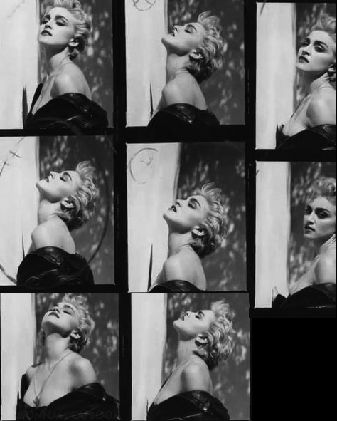
OMG this is beyond Glorious. Im speechless. Each shot is GOLD! stunning. How are people sitting on these gems? What is up with the Herb Ritts Foundation? There should be gallery of just this shoot and a book. they don't make iconic imagery like this anymore.
AGREED!!!!! My all time favorite shoot, That who's that girl tour photo they used on the tickets and to promote the tour is and will always be my favorite picture of Madonna and from this shoot it was taken, this has to be the first time i've ever seen some of these shots, Thanks Pud,
I love the colours of Bedtime Stories too! Just that there were so many outtakes I feel could have been used as a cover than the one that was selected.
YES...I totally agree with you. These are some great outtakes. I used them for my blog background.
I also think they choose the right photo for the cover of the album. I also like the very firstshot where she is looking at the camera.
I wonder why, back in the 80's there were hardly any pictures in the cassetes foldouts/CD booklets. I'm guessing because of the packaging restrictions. It would have been nice to see one of thes outtakes inside the foldout.
xoxo Checkout the background :) http://themadgestycollection.blogspot.ca/

OMG this is beyond Glorious. Im speechless. Each shot is GOLD! stunning. How are people sitting on these gems? What is up with the Herb Ritts Foundation? There should be gallery of just this shoot and a book. they don't make iconic imagery like this anymore.
ReplyDeleteI totally agree with you!!
DeleteThis is amazing!!!
AGREED!!!!! My all time favorite shoot, That who's that girl tour photo they used on the tickets and to promote the tour is and will always be my favorite picture of Madonna and from this shoot it was taken, this has to be the first time i've ever seen some of these shots, Thanks Pud,
Deleteiconic and wonderful! Her first "image makeover" This shoot makes me happy!
ReplyDeleteTHIS IS LEGENDARY!!
ReplyDeleteThey definitely released the right ones. The others aren't that good lol
ReplyDeleteTrue Blue's cover art is superb.
Thanks Pud! True Blue was the Turning Point! AOR at its most artful! Madonna's First Masterpiece!
ReplyDeleteOH WOW!
ReplyDeleteHVE WANTED 2 C THESE 4 YEARSSSSS!
(sorry i'm yelling)
Our Pudd delivers AGAIN! Every shot is worthy of an album cover. LOVE LOVE LOVE!I gotta get this blown up into a poster.
ReplyDeleteEVERY SINGLE SHOT is magic! These images capture her classic beauty while radiating a softness rarely seen.
ReplyDeleteNo.
DeleteNope. The True Blue cover is perfection, yes. The rest? Just okay.
DeleteOy, such a critic! They are all perfection. Fact!
DeleteI agree with Tony. Her album covers could have been classics, as she is Madonna, but some of them are fails:
DeleteI'm Breathless
Bedtime Stories
Music
Remixed Revisted
Hard Candy
ok so, maybe 5...lol The rest are pretty good.
And now I find...I changed...my mind.
She needs to hire Kylie, Beyonce and Lady Gaga's creative team.
xoxo
I love the bedtime stories album art. so romantic yet with a slight edge. loved the pastels, typography, styling, photography...
Deletethemadonnablog: u're a fan right?
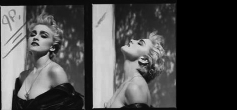
DeleteI love the colours of Bedtime Stories too! Just that there were so many outtakes I feel could have been used as a cover than the one that was selected.
DeleteAnd of course I am a fan. Love Madonna.
Delete@theMadonnablog, I wasn't referring to each of M's album covers.. I was commenting on the proof sheet above. Each shot is perfection.. in my eyes.
DeleteLOL - crazy me.
DeleteYES...I totally agree with you. These are some great outtakes. I used them for my blog background.
I also think they choose the right photo for the cover of the album. I also like the very firstshot where she is looking at the camera.
I wonder why, back in the 80's there were hardly any pictures in the cassetes foldouts/CD booklets. I'm guessing because of the packaging restrictions. It would have been nice to see one of thes outtakes inside the foldout.
xoxo
Checkout the background :)
http://themadgestycollection.blogspot.ca/
I'm Breathless and Music are excellent covers.
DeleteThe look on her face of the Music cover says it all: Awful, miserable album, full of lifeless, dark and dull music hehehe
MadonnaBlog probably thinks the Born This Way cover art is fantastic, no? :)
This comment has been removed by the author.
ReplyDelete